
PANTONE 2016: wedding colors

CAKE MAPPING
March 3, 2016
WEDDING 3.0
March 17, 2016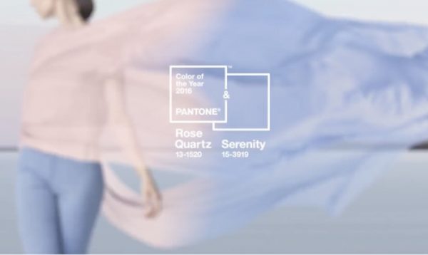
Pantone 2016: wedding colors
Are you still unsure about the wedding colors?
My dear little brides of the newly started year, today I will give you some suggestions for you to find the right inspiration in sight of your great day.
My friends, get ready then! The trendy wedding colours for 2016 weddings are bright and warm. The colour to choose has a very important role, this is why I suggest you examine very well all the different possibilities.
The 2016 season envisages very relaxing colors, paying tribute to nature’s beauty: inspired by the contrast between urban landscapes and luxuriant vegetation, designers have developed unusual and unexpected colour combinations accordingly. The starting points they were inspired by are architecture, journeys in exotic locations and nostalgic feelings and this way they tried to awaken a sense of reflection and escape. Great is the influence of artists like Picasso and Matisse and of Southern locations in the world, mainly Cuba, whose sceneries have always been playing with vibrant and full colours matching with more natural shades.
For this recently started season they were certainly not afraid to combine bright colours with others which are instead more calming with classic and natural tones.
Pantone 2016: wedding colors

All we have to do then is travel with our fantasy among settings, decorations, flowers and materials that can find inspiration among these fantastic hues.
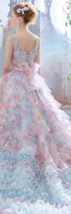
Let’s forget about cold colours such as lemon yellow or bright red and let’s make room to fascinating colours such as orange/coral, salmon and dark blue, everlasting colour, a great classic, ranging from royal to navy blue. Every shade of colour may be perfect especially if combined with white. Pink and purple can be used, but only in their warmest nuances. Another option to choose could be turquoise (Serenity) that, in contrast with Rose Quartz will be able to create a delightful combination. Timeless, as usual, is gold combined with white, no doubt an elegant arrangement. Thanks to these wedding colors your day will be even brighter and very trendy.
The colours of Spring 2016 convey a sense of positivity aiming very much to steady and thoughtful optimism. An important diversion from this theme is offered by Buttercup, sunny and bright solution. It is necessary to also have basic and neutral colours available, Lilac Gray, a subdued shade of lilac, a medium grey will add a distinctive character to your wedding and will be one of the axis of the palette potentially matchable to any of the other colours. The same goes for Iced Coffee, the other great neutral colour of the season: its dusty and light brown recalls the Earth and makes it a stable base combined with the remaining range of colours of this new season. And if you want to dumbfound your guests, then all you have to do is focus the attention on Green Flash, an almost fluorescent touch, whose bright green will give a great sense of modernity.
Make way then to your wildest fantasy and combinations. We still have a long Winter ahead of us, but if we stop and think about Spring I am sure you, like me, will find it a little less grey and cold.
THANK YOU